Syself Brand Assets
Everything you need to show off the Syself brand the right way - logos, colors, and more, all in one place.
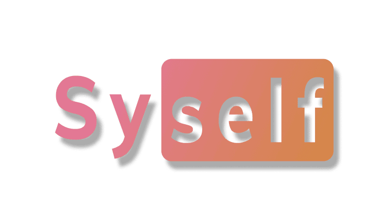
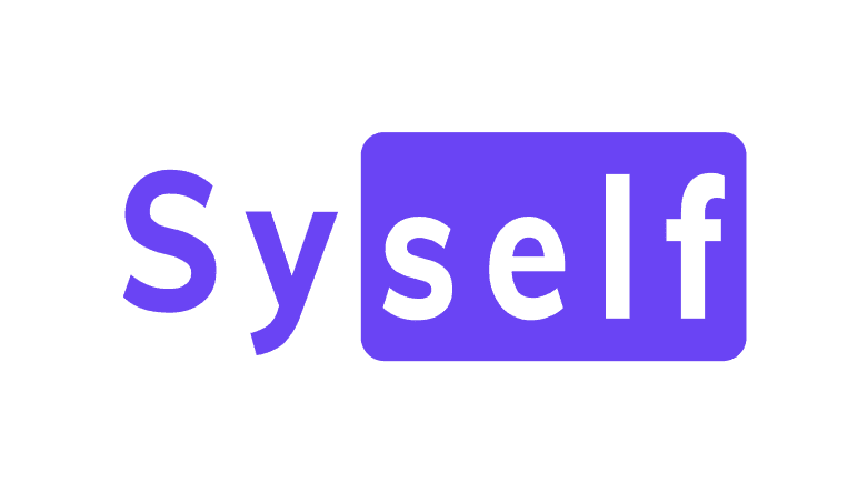
Logo
The Syself logo is the most important corporate asset that represents our brand and helps people recognize us at a glance. "Syself" stands for simplified, efficient and intuitive management of Kubernetes. The promise is that through the synergy of technologies and self-management capabilities, users can spend more time on their core tasks and thus increase their productivity.
Clear Space and Readability

Give the logo room to breathe! Always leave at least 0.5x the logo’s height around it.
Syself Co-branding
When Syself has an official partnership with another company, the following visual hierarchy should be maintained in public-facing announcements. Each logo should be approximately the same size overall with consideration to both width and height while retaining optically centered.
Respect each brands logo spacing rules
Try to keep each logo approximately the same size overall with consideration to both width and height while retaining optically centered.
Usage
Do
Use the official logo files provided by Syself to ensure correct proportions and colors.
Maintain clear space around the logo to ensure visibility and avoid clutter.
Use the approved color versions of the logo.
Scale proportionally when resizing to maintain the original aspect ratio.
Use the logo on approved backgrounds that ensure readability and visibility.
Don't
Don’t distort the logo in any way.
Don’t add effects like shadows, etc.
Don’t choose unapproved colors.
Don’t rotate, tilt, or flip the logo.
Don’t place on low-contrast backgrounds.
Don’t place on busy backgrounds.
Color Palette
Syself's color palette combines calm professionalism with dynamic energy. The deep blue symbolize stability, reliability, and vast possibilities, mirroring the sky and sea.
The accent colors, pink and orange, bring warmth and innovation, inspired by a sunset, representing transformation and new beginnings.
A gradient from pink to orange reinforces continuity and progress, visually communicating Syself’s commitment to seamless automation and customer success.
Typography
We use Mulish as our primary typeface to create a modern, clean, and highly legible visual identity that aligns with Syself’s professional and innovative brand personality.
Mulish Bold is used for headlines, ensuring strong emphasis, clarity, and a confident presence in all communications.
Mulish Regular is used for body copy, offering a smooth reading experience. Its balanced proportions and refined letterforms ensure that even complex technical information remains clear, engaging, and easy to digest.
Typeface
Mulish
ABCDEFGHIJKLMNOPQRSTUVWXYZ abcdefghijklmnopqrstuvwxyz0123456789 !@#$%^&*()
Bold
Use this weight for headlines
Regular
Use this weight for body copy

About Syself
Syself automates of the entire lifecycle of clusters, freeing up your teams to work on what really matters.
Our Technology Powers Critical Infrastructure at
Your All-in-One Kubernetes Solution
Syself Autopilot is a fully automated Kubernetes management platform that allows you to launch production-ready Kubernetes clusters in minutes.
